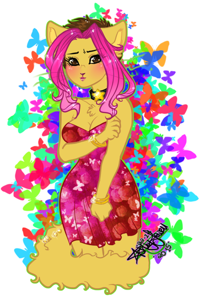
 Paulo PauloxLucy (787x862, 1.2MB)")
Too much color, if i were to say is dizzying i would be using an hyperbole. Also her nose and mouth seem too small.
I'm sorry for giving a negative opinion.
Image Details
Favorited By
agentchimendez
Bearkidney
bluefox
dirtdog1996
fancy_landmine
HelTH
Hipster
jiwinu
Kate1200
MiwAuturu
moozers
notyoursenpai
Oso-De-Clare
Popcorn-Tart
safarisucks
SirSaltiness
strawberryquartzcat
Bearkidney
bluefox
dirtdog1996
fancy_landmine
HelTH
Hipster
jiwinu
Kate1200
MiwAuturu
moozers
notyoursenpai
Oso-De-Clare
Popcorn-Tart
safarisucks
SirSaltiness
strawberryquartzcat
Tagged With
Image
Comments
Comment ID #64641
Comment ID #64642
dont listen to that dude
man, this is art xd
I cant even do this ;-; senpai teach me
Comment ID #64643
Everyone's got there own opinion. I personally like it. It's colorful and the style is...stylish! I really enjoy bright pieces from time to time!
Comment ID #64645
Juan_Pablo, can you lay off the armchair critique for a while? I’ve noticed it across most of your posts on Candybooru. This is meant to be a place to archive BCB fanart and give artists encouragement for posting great things like this picture, not to show off your criticism skills over what often seem to be stylistic choices that don’t really need it. Maybe leave that to deviantART comments or solicited critiques over email?
Comment ID #64646
Thankyou everyone for the comments ![]() maybe I'll do a stream one day and you guys can see how I do everything.
maybe I'll do a stream one day and you guys can see how I do everything.
Moving into jaun pablo: thankyou for the critique but if I had meant for it to be a duller image I would of dulled the Colors down. This is suppose to be a more upbeat picture and nothing, to me, says upbeat like vivid Colors. As to the mouth and nose ratio, to that is just how I decided to make them as smaller features seem to be more feminine looking I can tell by your art that you have a completely different style from mine so it's okay to have an opinion but. I would just like to pass on that not everyone has the same technique, and if we all drew things the same that would be boring. But thankyou for the critique none the less ![]()
Comment ID #64647
this is gorgeous, i love the colors, the white background balances it perfectly, and the pattern for the dress is adorable :^)
Comment ID #64648
She has a daisy tail ![]() . Very cute picture.
. Very cute picture.
Comment ID #64652
Starlocket, i understand. Is my opinion that too much and too vivid colors are intrusive; we have a disagreement in this. By the way, i will love to see you do a stream.
SuitCase, you're assuming too much. I'm just giving my thoughts on the pictures; whatever they might be. Should i then hold back a comment merely because, part or the whole of it, is not positive? Isn't that again the very purpose of a comment section?
Comment ID #64653
@Juan_Pablo
I dunno if it's a problem that you're critiquing it, but more so at least in your first comment, you had nothing nice to say about it. It's alright to have a negative opinion, but if that's the only kind of opinion you have, especially when the artist did not ask for critique, then it comes off less-than polite and not all that pleasant. Something to maybe keep in mind?
I think the saying goes, "If you don't have anything nice to say, don't say anything at all." I know that doesn't apply to all situations, but it's something good to keep in mind.
On another note, I love, love, LOVE the bright colours and the posture of her body, making her look shy which is refreshing for Tess. Since she's so damn boisterous most of the time. xD
And that dress is fabulous on her~ Lovely job I'd say!
Comment ID #64656
Yaschiri, i'll keep it in mind.
Comment ID #64658
Hm I dunno what's so wrong about having a small nose in a picture as long as it makes sense or is done well. My first reaction was, "wow, I like that picture." In fact this picture is colorful, lively, and has lots of interesting textures, with a strong control over anatomy. Something about the face is a little off, but it's not the nose, it's more like the skull itself or maybe it's mouth, I'm not entirely sure. I think I can see what you were trying to do and this is where some of the difficulty in mixing the anatomies of cat and human skulls together are most present. Honestly though, it's better than I can do, I haven't done jack shit in the way of practicing so that's why it's not great.
Btw Juan_Pablo, a single sentence does not make for a thorough critique. I'm not saying that mine is as thorough as it could be, but try to put more ideas, preferably connected ideas, in your future critiques.
Comment ID #64659
Thankyou everyone for the comments xD I just checked back on this. I don't mind critiques and I can tell you exactly where the face is throwing everyone off. Her mouth and nose positioning is off center as the more I look at it the more I realize that the jaw isn't sitting right, which then makes the whole mouth area look weird. Not saying it's not small but with cat anthros I tend to make the Noses smaller too (I'm use to drawing my oc which is a Fox xD) I mainly just did this for fun so I wasn't being overly thorough with this. To be honest this only took me 75 minutes to mash out. I mean it is fantart which is like a gift after all ![]()
Comment ID #64674
You're really cool. Not only you're open to feedback but you're willing to change your work based on it; that's really nice of you. I liked it, i think Tess own colors stand up more.
Comment ID #64738
I love this!!!
 How to make a retina webcomic
 Abbey can’t stop the beat
 Pregnant pause
 Gaining momentum
 lucy can has
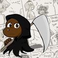 Comics, back from the dead!
Comment ID #64640
on DA as well: http://scarl3tt-rav3n.deviantart.com/art/Tess-in-a-dress-514763594?ga_submit_new =10%253A1424229917
Starlocket on February 18, 2015.