 Daisy (1912x1353, 703.5KB)")
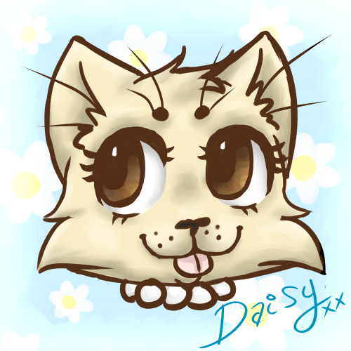
whenever you shade, you should never ever use black, gray, or a darker color of what the main color is. my rule of thumb is the opposite of what the color is on the color wheel, called the complimentary color. for green you use red, for blue you use orange, stuff like that. i have one piece of abbey and daisy where i used the shading in a lot and with a lot of other artists, they even use a dark red with opacity to like 30-20%. using black to shade will always make the art look dirtier like they were playing in mud lol. i hope this helps!! and if you have any questions let me know and ill help ![]() im not an amazing digital artist whatsoever, but i use a lot of tools some of the greater ones taught me!! always try to experiment with vibrant colors instead of just darker hues of what you already used. i have an art tumblr called toreesucks that even has a few tutorials under #ref if that helps too!!!
im not an amazing digital artist whatsoever, but i use a lot of tools some of the greater ones taught me!! always try to experiment with vibrant colors instead of just darker hues of what you already used. i have an art tumblr called toreesucks that even has a few tutorials under #ref if that helps too!!!
Image Details
Favorited By
Tagged With
Image
 Webcomic Party
 Abbey can’t stop the beat
 Michael-kun is my boyfriend.
 Menage-a-trois
 Chat with us on Discord!
 A touching tale
Comment ID #66725
I have decided to draw some daisy

she has grown on me~
Creative criticism is much appreciated <3
LetsBananas on August 4, 2015.