Another wallpaper. Mike falling is pulled from the source, thus Taeshi is linked as author.
I tried more contrast with this, though it ended up a lot brighter in general than I'd have liked.
Image

Comments
Comment ID #38433
I like this
The layout seems balanced, and I like the color choice for the glow, it definitely keeps consistency with the mood
Nice job ![]()
Comment ID #38456
I was JUST working on something almost IDENTICAL to this! But I got lazy and deleted it.
Nice job! Love the mood you created ![]()

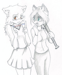
 The good guy has to win somehow!
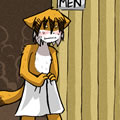 Trauma in the shower
 She ain’t easy
 lucy can has
 BCB on TV Tropes
 Webcomic Party
Comment ID #38400
deep...
Raxki on September 13, 2011.