Search TipsTags with spaces are represented with underscores, so instead of searching for BCB Art Meme, search for BCB_Art_Meme.You can search for images containing multiple tags, just use spaces to separate them. Sue Daisy will find pictures containing Sue and Daisy together.You can subtract tags from your search. Lucy -Mike finds pictures of Lucy without Mike in them.You can search for metadata like user (uploader), size (pixel dimensions), image ID, aspect ratio or file size. Examples of metadata searches: user=SuitCase, size=1024x768, id=1233, ratio<2:1 or filesize>=3MB.You can find images people have added as their favorites, like favorited_by=Taeshi.Finally, you can search by date. Try posted=2010-12-25 to see images posted on Christmas Day 2010.
Actually, the head is kinda realistic for a real human model in terms of size. And yes, they are human... It was stated when Paulo was comforting Lucy.
"I'm treating you like a human, not a piece of meat."
'Sides, its a drawing style. No need to say its incorrect when it comes to cartoon kitties, humans... Cat humans, whatev'.
The only thing I could say to improve it, would be to put in some shading here and there. Other then that, the design is good.
I really like the colors you chose for this! It looks gr9 omg, keep it up!
and @Juan_Pablo, who are you to decide what's wrong with Tattleblue's art or not? I think that the proportions are quite accurate, honestly,,
In my opinion, I think that there's a fine line between positive feedback and full-on criticism. It takes a lot of guts to post art online, and I think that you should support them, instead of telling them every single thing you dislike about their piece. Sorry if I sound rude, but I feel like all you've been doing is critiquing, and maybe that sort of concrete feedback could be good for some, but for others it can be quite discouraging.
I swear there was a warning about playing armchair critic before.
The existing line work is actually strong, because the lines bend and show some motion. I'd agree with the other users and say you could definitely shade it, if you want to take the picture further.
When cartoon or abstract artists are too fixated on things looking mathematically proportional, we get stuff like Marge in the 2009 Simpsons intro. You know how to appeal to the human eye, so please, keep doing what you're doing.
So this was done as a bit of lineart practice, and I only made an account here and uploaded it on a whim... but I NEVER expected such lovely comments and feedback!! Thank you guys so much for taking the time to do that, I think I will carry on drawing BCB fanart in the future
 Lucy Madison (1000x800, 212KB)")
 Haley’s plan
 Candybooru image #11968
 Yaoi fangirl
 Read a page early on Patreon
 In a tight spot
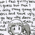 Stop your crazy brain
Comments
Comment ID #70852
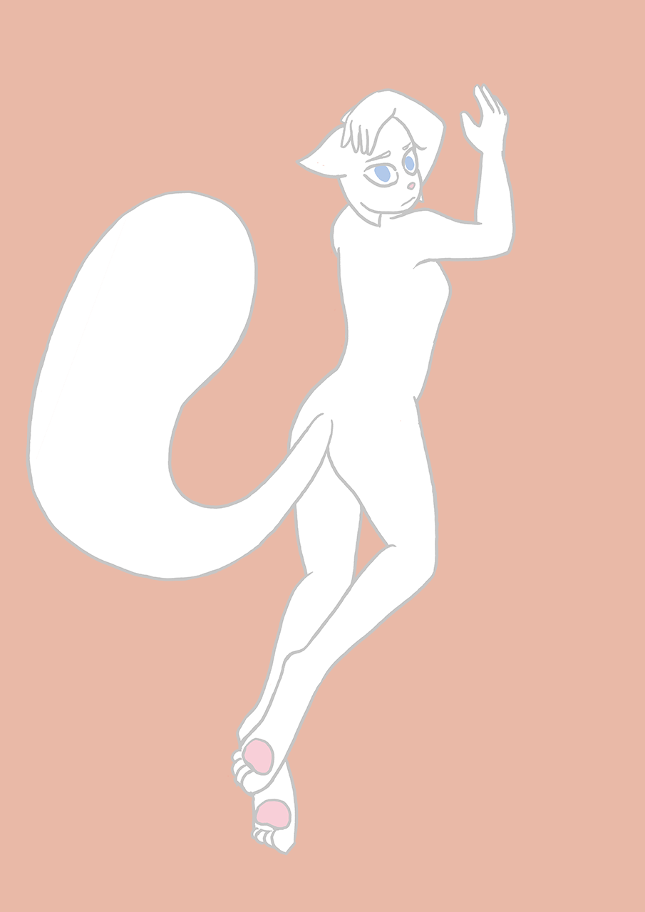
Head is too small in relation to the rest of the body, you may want to take that into consideration in the future.
Juan_Pablo .
Comment ID #70855
Actually, the head is kinda realistic for a real human model in terms of size. And yes, they are human... It was stated when Paulo was comforting Lucy.


"I'm treating you like a human, not a piece of meat."
'Sides, its a drawing style. No need to say its incorrect when it comes to cartoon kitties, humans... Cat humans, whatev'.
The only thing I could say to improve it, would be to put in some shading here and there. Other then that, the design is good.
Kinroth .
Comment ID #70870
I really like the colors you chose for this! It looks gr9 omg, keep it up!
and @Juan_Pablo, who are you to decide what's wrong with Tattleblue's art or not? I think that the proportions are quite accurate, honestly,,
In my opinion, I think that there's a fine line between positive feedback and full-on criticism. It takes a lot of guts to post art online, and I think that you should support them, instead of telling them every single thing you dislike about their piece. Sorry if I sound rude, but I feel like all you've been doing is critiquing, and maybe that sort of concrete feedback could be good for some, but for others it can be quite discouraging.
notyoursenpai .
Comment ID #70876
I swear there was a warning about playing armchair critic before.
The existing line work is actually strong, because the lines bend and show some motion. I'd agree with the other users and say you could definitely shade it, if you want to take the picture further.
When cartoon or abstract artists are too fixated on things looking mathematically proportional, we get stuff like Marge in the 2009 Simpsons intro. You know how to appeal to the human eye, so please, keep doing what you're doing.
not_used .
Comment ID #70888
So this was done as a bit of lineart practice, and I only made an account here and uploaded it on a whim... but I NEVER expected such lovely comments and feedback!! Thank you guys so much for taking the time to do that, I think I will carry on drawing BCB fanart in the future
Tattleblue .
Comment ID #70891
I'm looking forward to it, judging by the standard set here.
not_used .