Image Details
 (848x876, 114KB)")
Tags
Favorited by
1434939
Bearkidney
Bunnygirl666
Byrd
ChewySmokey
CoveyCube
cowuhbungadude
crazyprinc3ss
doodlekris
Gingerpixels
Harmonio
inactivechannl
jeroenhd
KittyDoughnuts
KL
loveparty
MightyenaQueen
Oreoflavoredcinnamonroll
PepeLePew
plantwarden
quartzbunny
Scarlet
SCD
Seabreeze630
shoumei
SOUP
Terry
The_Mylestone
Tiptuk
TravelPastel
Yaschiri
Image
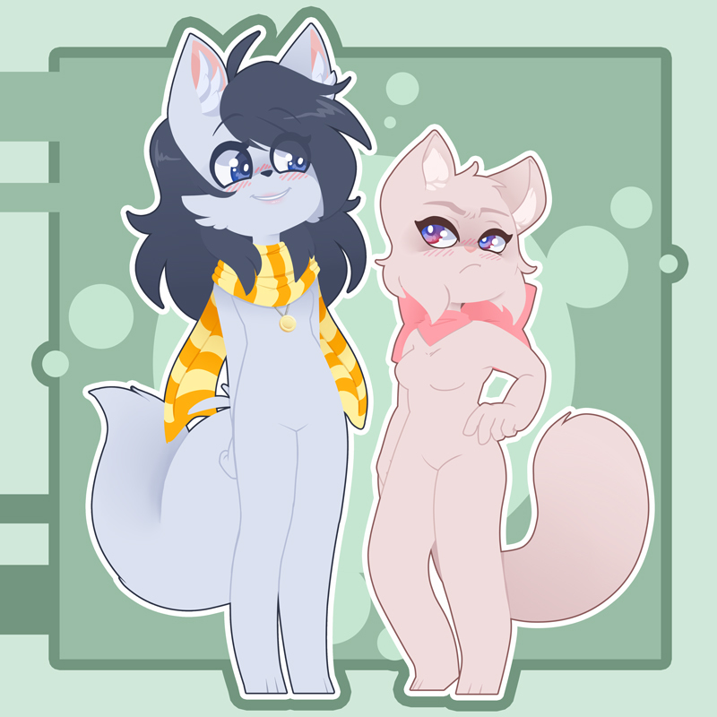
 Candybooru image #14595
 Where’s that spindash, again?
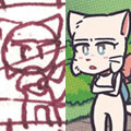 Unlocked: Unspoken Rule
 Haley’s plan
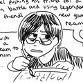 Hourly Comic Day 2014
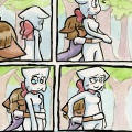 Unsolicited but appreciated
Comments
Comment ID #81182
criticism is appreciated!
JayGamer .
Comment ID #81183
i dont think theres rly anything wrong w it considering the style and stuff. very cute!
if i had to nitpick i would tell u to push the poses a little more and make sandy lighter, shes gray enough that i mistook her for a genderbent mike
anyways wow good picture! fuck u u did good!
SOUP .
Comment ID #81184
Lucy and Sandy as shinies.
Cool drawing.
SCD .
Comment ID #81185
it's really good and cute! what soup said about pushing the poses more, and maybe practice fabric shapes/shading more--the scarf fabric around sandy's neck vs the fabric falling behind her look like they are of a different quality and weight. i guess another way to say it would be consistency of fabrics around different shapes? anyways, good job!
irreverses .
Comment ID #81187
damn this is gorgeous
ChewySmokey .
Comment ID #81197
i think the style looks really cute! i love it! especially sandy's eyes. they're so bright! i think i really like how you made the proportions for her face.
hmmm yeah i'd have to agree with soup, i'm not sure how cartoony you'd want to make your work but you could try to push the line of action for the poses? i think sandy's balance looks a little off- like it looks like she can potentially fall over? i'd probably rotate her head and her left leg.
but anyways! i really like this! it looks really good!
Box .
Comment ID #81199
LUCY'S EYES ARE MESMERIZINGGG~
TravelPastel .
Comment ID #81203
Is that a Lucy "I don't like you" or a Lucy "I don't like that I like you" ? Can you ever tell with Lucy?!?
Rateus .
Comment ID #81217
thanks everyone for the kind words and constructive criticism! so the general take away is: more lively and balanced poses (i tend to be pretty strict with posing because i try to avoid overemphasizing personality traits, *but* i'm sure there's a way i can make characters look more lively without making them unrealistic! i'll research and practice more in general), not be so scared of bright colours (jfc she does look like mike...), and fabric consistency. good to hear people like the style though!
JayGamer .
Comment ID #81232
wow, i love the subtle shading in this, feels kinda semi-lineless <3
Terry .
Comment ID #81369
Loved this so much it's been my phone lock and home screen. Especially like they're facial expressions, it's so good!
ChewySmokey .
Comment ID #81394
Wow I just looked through all of your art ( I love your style) all the way back to the beginning and I must say you have improved SO MUCH. watching someone grow as an artist is the best because it gives hope to those of us who are still kinda early in the process. Do you have a tumblr I could follow?
Civvi .
Comment ID #81398
Oh man, that's such a sweet thing to say, thank you Civvi! I do have a tumblr, if you wanna look (I forgot to add it to the source like I usually do haha): http://jeicob-evurrist.tumblr.com/
JayGamer .