Intermission: False Start, page posted 3/23/26
Page 6 of 6
- First chapter
- Chapter start
- Next chapter
- Latest page
Author commentary
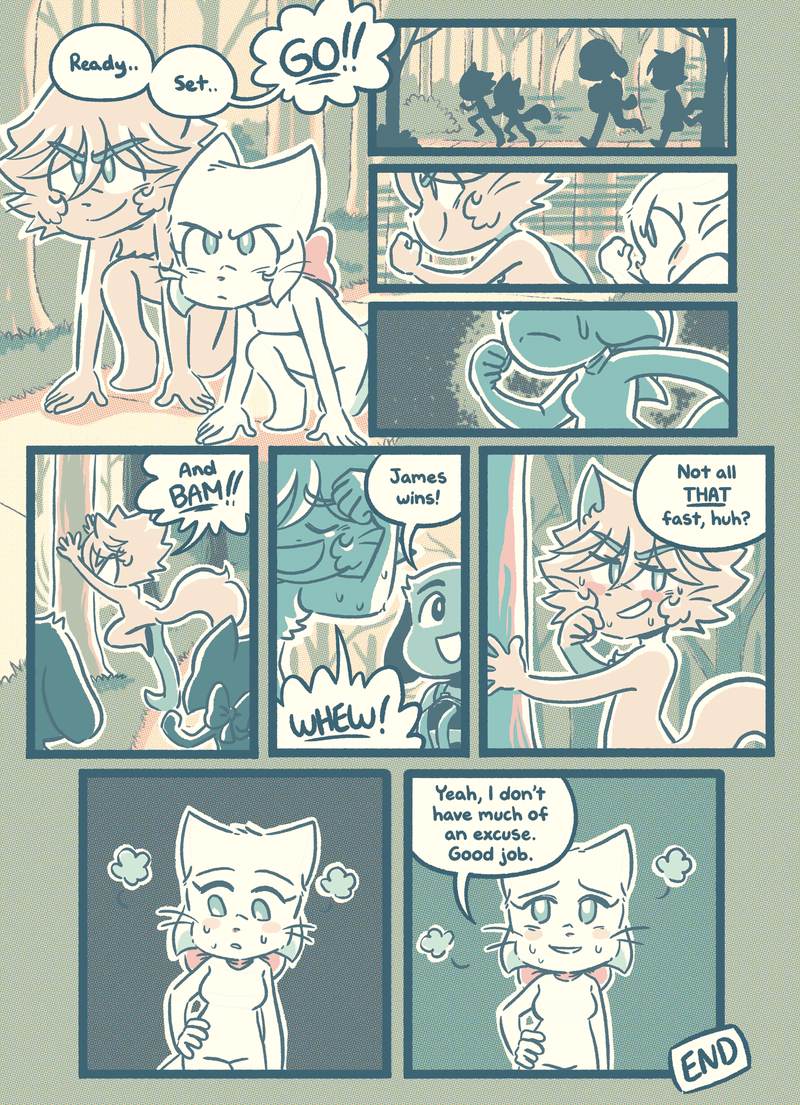
Veronica: Ouchie.
Thanks for readinggg!!
I’ve murmured a lot about wanting to change BCB’s style. It’s been a long time coming! There’s many reasons why I’ve made this choice, and I can talk about that now that we’re here.
While I do like the full-colour style that we’ve used from Guest of Honor until today, it was really taking a toll on me. The full-colour style inevitably became more complex over time (I never used to do coloured lineart in Volume Six, for example…) and it became a struggle to keep up with three days a week updates if anything else got in the way, like a book or travel.
It was overwhelming! Any times we had to resort to posting a BCI comic or book exclusive to maintain the update schedule made me feel lazy and incompetent!
As usual, when I come across struggles like this, Souppy tries to find a way to problem-solve. One avenue was finding a flatter.. then prefilling character colours… Eventually we commissioned a background artist to help with backgrounds, and while that did help a bit, the lack of control was eventually driving me a little insane. Turns out I’m a control freak! Inevitably, despite all attempts, I found myself redrawing backgrounds to match my lineart! Sometimes the background didn’t match the foreground and I could not let that stand! So we paid for backgrounds and then I'd redo them again. It was becoming quite unfeasible!
This new style isn't just because I want to make comics faster, mind you. I just didn’t like working in phases. That’s a huge reason I stopped working in watercolours - so much of the process requires working in phases while the paint dries, especially when I used to do coloured lineart. It’s the kind of process that really fatigues me. So I started to get that feeling again - the familiar feeling I got at the tail end of Volume Three and Volume Five, where I wanted to change to a different style.. where I wasn’t really feeling the joy of drawing anymore. I wanted to get that spark again, and that spark usually happens when I shake things up.
And that takes us to now!
I’ve noticed a normalisation of webcomics NEEDING to be in full-colour. We can blame Webtoons for that, of course, we can blame Webtoons for a lot of crappy things that have affected art in webcomics.. but in my case another reason I wanted to change styles was because I love limited palettes! I love monochrome! I think those kinda comics can look REALLY cool!
In some ways I wanna be like.. screw you, Webtoons! Monochrome comics, or comics in limited colours can be just as beautiful! They can be just as awesome to look at! They’re not any less than comics in full-colour! And I want to prove that! I want to rebel against the machine! I want to go against the grain!
There’s something about Volume Two I always return to.. I feel like Volume Two was genuinely the most fun I ever had making comics. I remember switching styles in Volume Three because I felt I had to - like being in full-colour was an “upgrade” to make BCB super serious. Even back then, that was how it felt.
At the time that’s what BCB was graduating to - from my hobby to my full-time job.. from monochrome to full-colour, but my heart always yearned for Volume Two.
But I also know I’m existing in the current webcomics world.. where people EXPECT full-colour.. where webtoons has normalised full-colour.. so I’ve chosen to have my cake and eat it, too!
And so after all that, let me talk about the new style!
This new style is not fully monochrome.. it’s a limited set of colours, carefully chosen. With distinct vibrant foreground colours versus the warmer background colours. Choices were made to keep things bold and clear enough to be readable, but also to give me freedom in conveying the right moods for a comic like BCB.
I want to thoroughly thank Suyari for providing this beautiful palette to us. When Souppy and I attended Comitia 151 early last year, part of our goal was to find inspiration for a new style among all the talented illustrators. And Suyari was an artist I was instantly attracted to — her paintings and books are totally gorgeous. We share an affinity for the same colours, particularly in her blue-green and pink works, so it seemed inevitable I'd reach for her book when doing colour experiments.
And then we asked for her help and she collaborated with us to find the colours you've just seen the current chapter in!
As always, every BCB style change means growing pains… I'll be playing with this style until I finally feel fully comfortable in it. But future chapters will use the same palette!
ANNIVERSARY SALE: We're clearing out the vault!
Talk about this page!
Share
Share this page with a short link:
http://bcb.cat/c128.1/p6
Or just click a button:
Chat
Make new friends, discuss the comic and share your art in the BCB Discord:
 Buried Treasure
 Candybooru image #5780
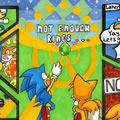 Half-pipe half-pint half-wit
 Another day of being garbage
 She ain’t easy
 Rough night
Comments from Patreon
Comment ID #124992
I like that Lucy gets a new bestie
Zambies
Comment ID #124993
I knew she would lose to a snake lol
ABCDBUTLUR
Comment ID #124994
LMAO
Insomni-act
Comment ID #124995
Did… I don’t know maybe it’s me but did it feel like she was hesitating for a moment there? Or like winded so fast?
Joselyn Rivera
Comment ID #124996
VERO I LOVE THE NEW STYLE AND READING YOUR THOUGHT PROCESS AAAAAAAAAA so cool
Zambies
Comment ID #124997
No patented Lucy comeback? Man she really must have had fun with that race (and also be tired)
Fiver
Comment ID #124998
Oh I just realized that her expression may be from the fact that there’s no one she’s been running around with anymore??? Things have really changed…
Zambies
Comment ID #124999
somehow I suspect hiding the effects of the suicide attempt isn’t going to work on people that know about the suicide attempt
SomeColourMage
Comment ID #125000
Yeah i was going to say the same thing. I wouldnt be surprised if she messed up her hip. Maybe this race was more so about testing herself rather than trying to win.
Brittany
Comment ID #125001
love the new style love lucy and love bcb !!!
Catcata
Comment ID #125002
Maybe I’m overthinking things, but isn’t she stroking the part of her body that she landed on during her suicide attempt on the last panels? That’s genuinely heartbreaking if her attempted suicide has not only mental but also physical ramifications (not being in the run like she used to in this case).
Steven Marshall
Comment ID #125003
That’s the side she fell on when she attempted right? So maybe shes feeling pain still from it?
Lake
Comment ID #125004
I think this and also she’s been having so many dreams of running from fear, as well
Hazel
Comment ID #125005
Ohhhh Lucy ;__; you really did a number on yourself, huh? Things sure aren’t what they used to be…
Antares
Comment ID #125006
The new coloring style and color palette are sooo pretty by the way, I think you’re doing a wonderful job with using the limited colors very effectively! Hopefully this makes finishing pages easier on you, and getting to hear the process behind this change is very cool!
Antares
Comment ID #125007
Lucy has had a bit of “Oh shit, this guy is JUST like Mike after a race, do NOT want to get mad, and fuck my side is hurting why am I not as fast anymore” face equipped.
Amione
Comment ID #125008
Love hearing about the process and mentality behind the new style change! Fuck the system, limited pallettes are awesome, and I think this one looks great! Only bit of weirdness I felt was the lack of brown for David’s fur color, but I got over that pretty quick~ Overall, I personally don’t see this as a downgrade in the slightest. Style changes are practically part of BCB’s identity, something that even wound up as a point of brilliant visual storytelling in Dial Tone. It would almost be weirder if the art style DIDN’T change for the entire rest of the comic. At the end of the day, I think the correct style choice for a comic is whatever the artist is happiest working with, and it sounds like you’re really enjoying the new style, so as far as I’m concerned, that’s all that really matters! I really can’t wait to see more, incredible work as always~
Alec
Comment ID #125009
While I do love a good full colour comic myself, I super appreciate the webtoon rant and I am really enjoying the new limited palette. Volume 2 had some really great chapters and the limited colours were always such a memorable part of why they were good. I’m excited to see how it looks in future chapters with more emotional dynamics!!
GlimmerGremlin
Comment ID #125010
Good thing she doesn’t have to worry about that while running in her nightmares 😬
Insomni-act
Comment ID #125011
For whatever it’s worth, I really love the new style! I’m a huge fan of limited palettes as well, and I personally feel like plain full color is overrated and honestly kind of boring. This limited color palette choice is gorgeous, I adore it!!
Kaleigh
Comment ID #125012
Yeah Lucy you have to face the truth sooner than later, you can’t run from it, your feelings for Mike and your injury acting up, you’re hurting and acknowledging that and lowering your mental walls soon before you ruin your friendships with Paulo and the rest because Mike is gonna do something stupid and when the truth of everything Augustus did and you said is out you’ll actually be all alone.
AlienSpawn
Comment ID #125013
As much as I would have liked to see Lucy beat James, this result makes sense. She could still be recovering from her injuries from the fall and still struggling mentally from lack of sleep and her PTSD. In a way, this kind of mirrors Mike’s second-place finish in track with David, showing how much mental health can weigh you down even in physical activities, though I’m interested in her resigned response to the loss.
I’m loving the new style so far. I feel color can lend itself well to having those emotional moments hit hard with the cool pastel color palette. I loved reading about the process of you changing to it. It really does make me more inspired to make my own webcomic one day. Thank you for all the hard work you do for us!
Tyzel
Comment ID #125014
It’s possible she’s thinking about how Mike would always win whenever the two of them raced each other.
Ethan Mazur
Comment ID #125015
I’m happy as long as I get to read cat/dog drama. The old style from volume 2 is rather nice.
Eagerly waiting for the moment when Mike and Lucy finally make up with each other and become friends again.
I’m sure some messed up stuff will occur before they do become friends again though.
4 dabloons on Mike tries to end it all.
Ethan Mazur
Comment ID #125016
I honestly prefer the new style, it has a very unique look and a nostalgic feeling to the old chapters.
It taking less of a toll on you is also an added bonus
Kiall Vun Myeret
Comment ID #125017
As someone who started reading during Vol 2, I am deeeeeelighted by the change. I think the full color looked really nice, but this palette is SO pleasing to the eye in such a distinct way. Really looking forward to how you get to play with it to create different moods!!
Also LOOOOVE the detail of her looking down at where her post-suicide scar would be here.
bramblepaws
Comment ID #125018
Don’t get me wrong- I LOVED full color but specifically because of how you chose to color them! Like always using an off white/cream color for Lucy and August instead of white, how you found the perfect two-tones for eye color, and my personal favorite is seeing the pink of Lucy’s nose. BUT BUT BUT I really love limited palettes! One of my favorite parts of the omnibus redraw was seeing the black and white comics get their simple colors. I think you have a real eye for it already and this chapter proves it! I love the palette chosen so far and I’m so excited to see how it he style solidifies over the next few chapters!
Salmon
Comment ID #125019
ALSO Lucy on this page ;_; i was preparing to have second hand embarrassment in case she was gonna be a sore loser 😭 i wonder if she’s thinking about her injuries hurting or how she used to run with Mike… either way I didn’t expect this small chapter to highlight how much things have changed for me. I would even dare to say it’s made me feel very… bittersweet 👀
Salmon
Comment ID #125020
Totally understand the switch up, I do just beg of you to consider using higher contrasts between characters and background for accessibility!! Thank you
Kauphy
Comment ID #125021
No fair, James cheated.
This was a nice little chapter.
SCD